The Process (part 2)
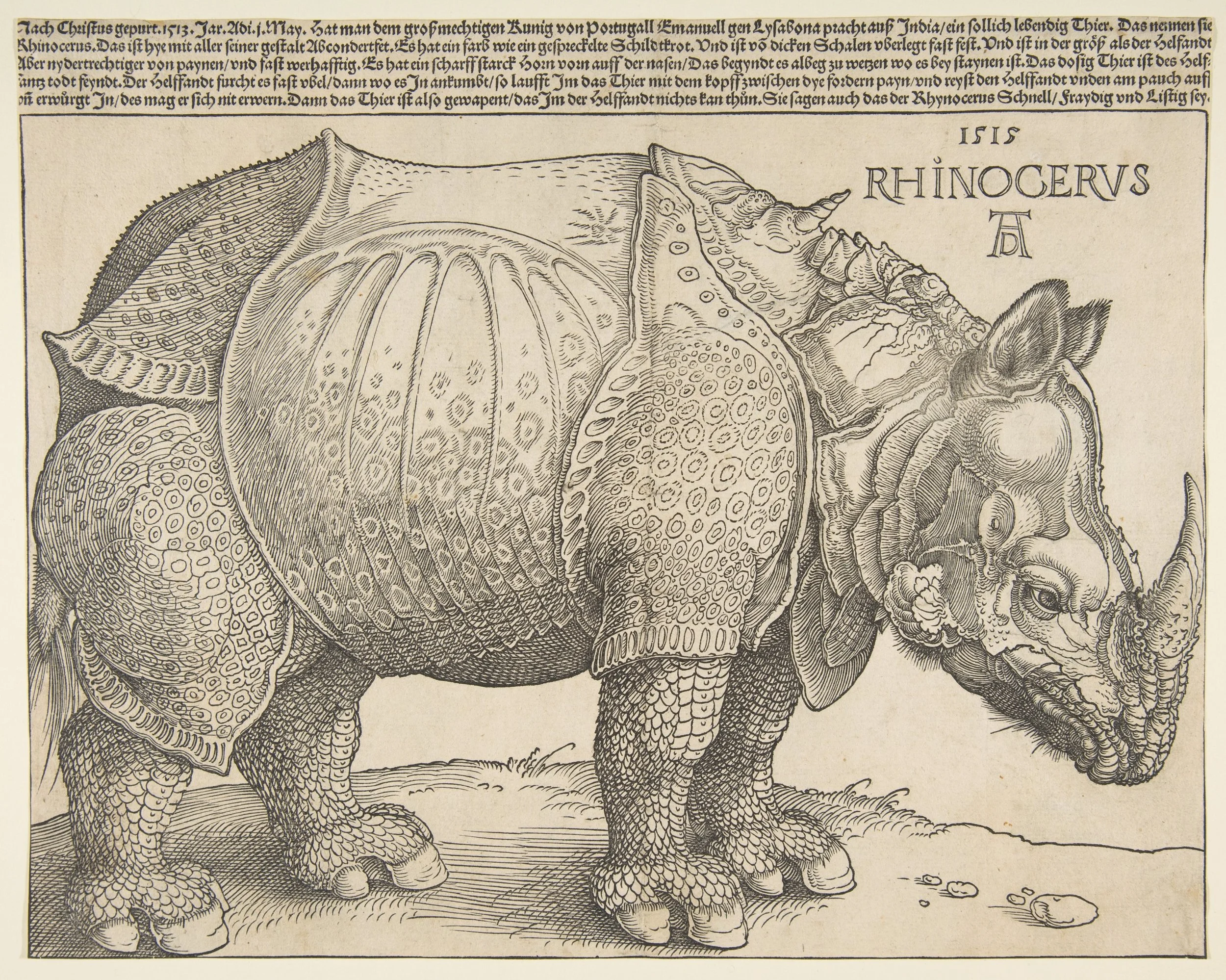
Albrecht Drer's 1515 woodcut of an Indian Rhinoceros. This image served as the archetype for how rhinos were thought to look. It was copied extensively and, with each duplication, the new artist added or omitted key details. Scientific illustration works the same way. If each new illustration didn't go to or rely on the source material or information, it would simply be based on the images that came before it and slowly, slowly corrupted.
The other day I described how I initiate projects. I'm lucky enough, on the project that I'm chronicling, to have Dr S, who has become quite good at playing art director. He knows what he wants to see. This often isn't the case with other jobs and I have to read the manuscripts, read the reference papers, become a bit of a temporary expert, and look for anatomical or molecular references. That's partly what makes this job fun, if you like learning, but it can occasionally get to be a bit much. On being a temporary expert, teaching and working in human anatomy for 9 years puts me in pretty good stead. It gave me a very good instinct for how anatomy actually works and what it looks like. This helps me immeasurably when it comes time to sort out where everything anatomical goes and how it works together. I get how much pressure and tension are on tissue, I know how those tissues can fold and swell. This is really valuable because if I went by what I saw in reference texts my work would always look like, for example, that heart or that pancreas in the book, which gets kind of boring and lifeless. Plus a lot of the reference images that do exist, like the image detailing cardiomyocyte metabolism that I showed yesterday, are simply awful.
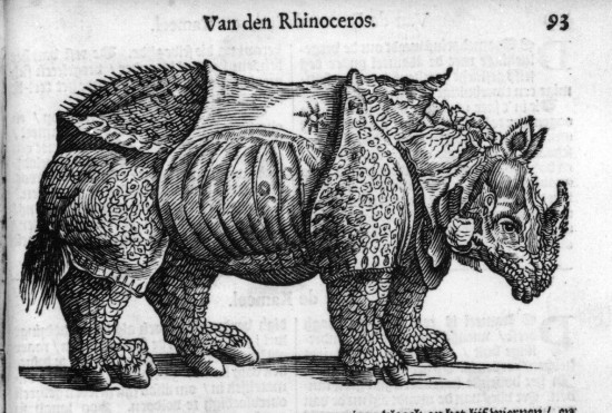
This is the 16th century equivalent to an internet meme.
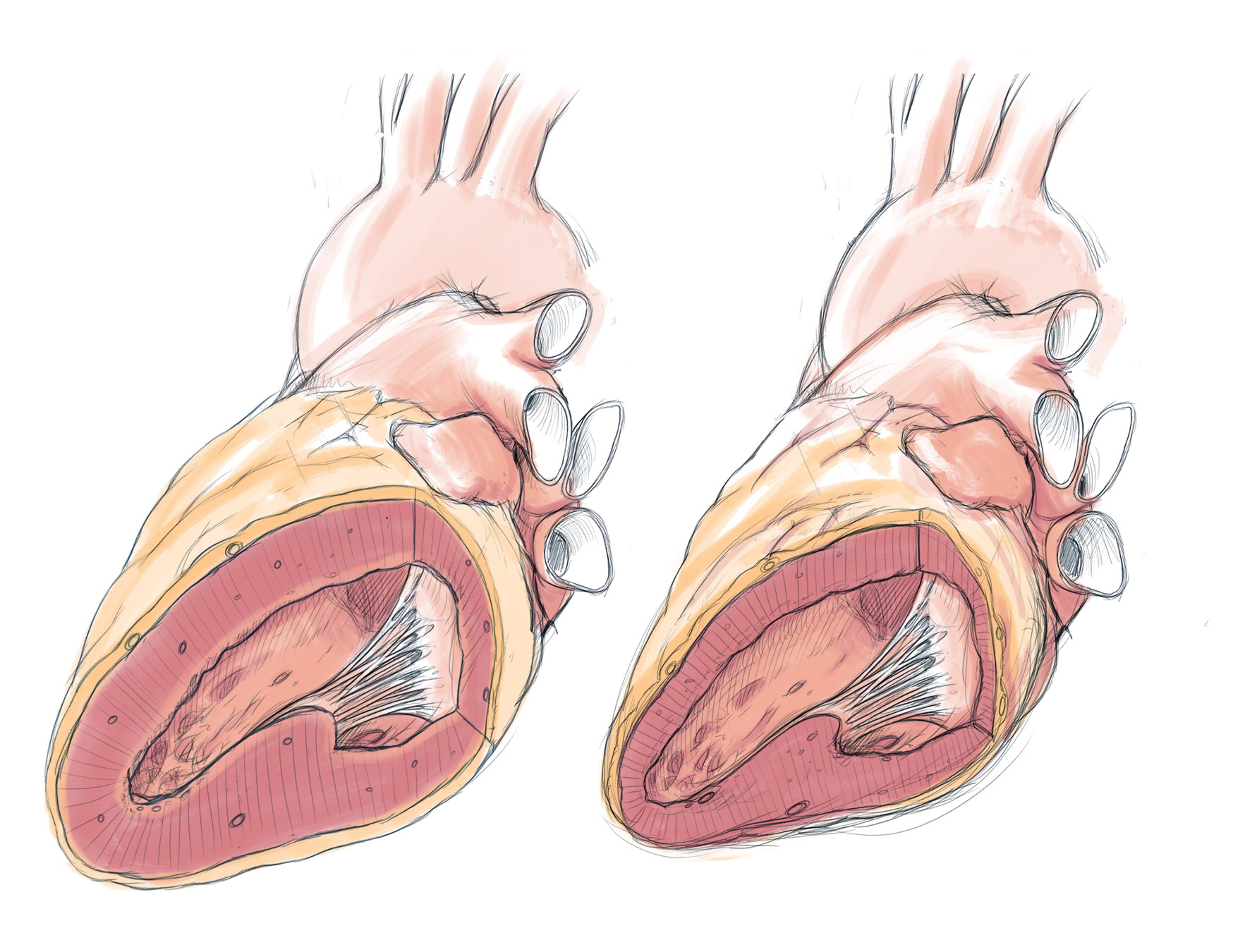
Quick digital sketch of the two hearts in the first image of the series; one with HFpEF, the other normal-ish. I sent this off to make sure my increased ventricular wall thickness wasn't too much or too little. 'Correct', comes the detailed response. I like the awkward angle of this image, but I don't like how I have shown the pulmonary vessels. This isn't supposed to be post-mortem so I'd like to avoid the cut-off vessel look.
But were I to continually lean on the images of those before mine, I would incorporate those artists' peculiar ways of drawing that tissue and, even more importantly, I would incorporate their errors and omissions. Anyone coming after me would then derive their work from mine, watering down the information even more. Like a big visual game of scientific communication telephone: the further we get from 'the source' the less like it the work becomes. Maybe that's how we pass off that generic heart shape as a heart. It doesn't quite look like one, but if you look at it forensically you can see what steadily got omitted and how it maybe got there. There's a story that illustrates this effect involving the great German renaissance artist Albrecht Dürer and his famous rhinocerous woodcut. Dürer created that image based on another persons description and their rough sketch. A combination of his artistic 1500's street cred and the fact that nobody else in Europe had properly documented an Indian rhinocerous meant that his image was the archetype for hundreds of years. Others copied it, and each time they did the rhino got weirder and weirder. It's very easy for scientific images to do the same, particularly when we're illustrating things you can't readily see everyday. I digress, though, always with the history lesson.
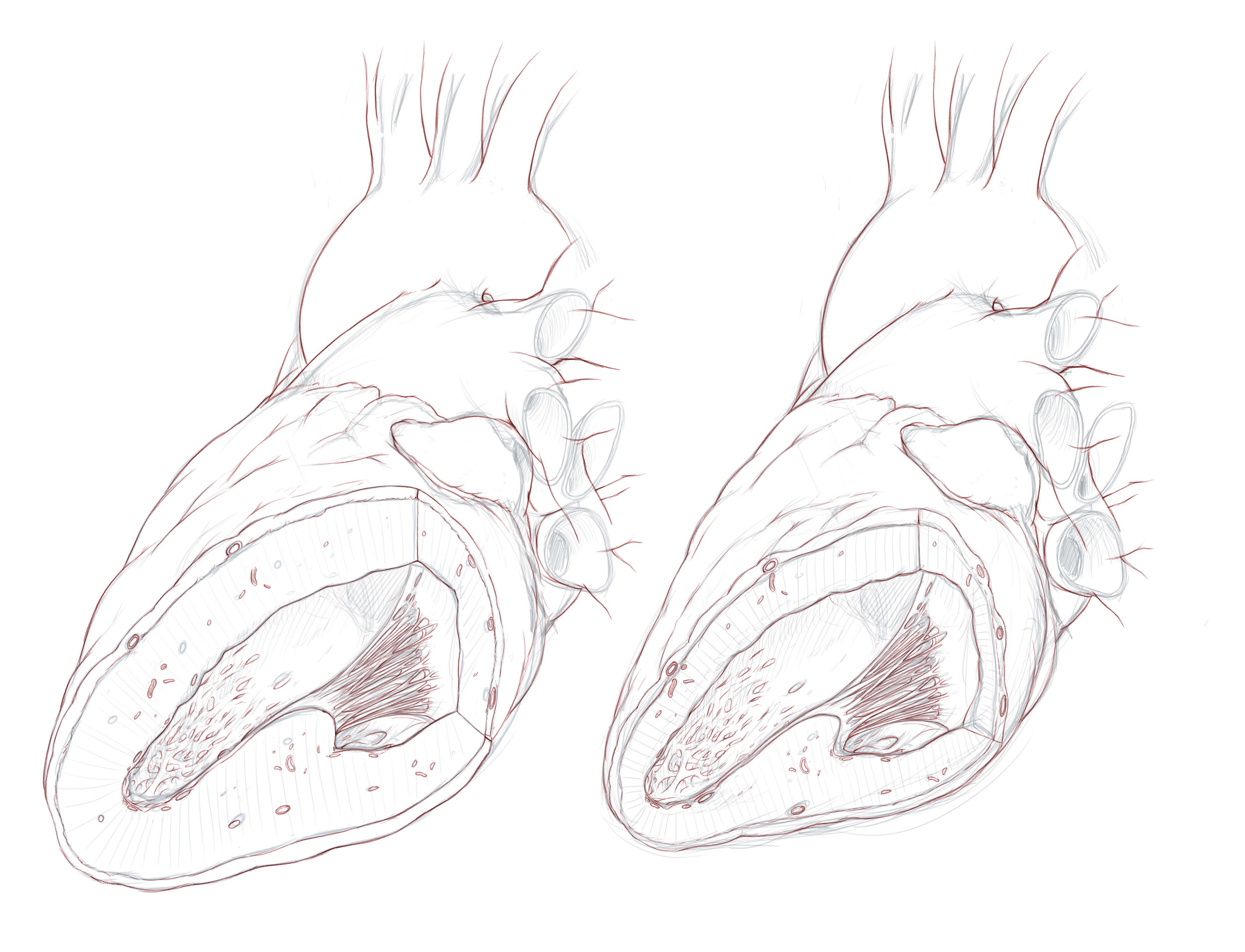
Since those initial sketches were fine, I can do final pencil sketches over top of them and refine it a bit more, add more details etc. You can see the original sketches in the background.
So I sent off the initial rough sketches to see if this is what Dr S had in mind. These aren't accurate sketches at all, but are just good enough to get the idea across. Then we meet (in this case on a busy night at a north Toronto pub). We discuss, we scribble on the existing sketches and we make new ones on napkins or proper paper if I bring it. Fortunately, with these sketches, I'm on the mark so far and I can advance them a bit to produce the next ones.
I've always been a pencil man. By that I mean, I've always pre-drawn artwork with something like a pencil. It's rare, with a painting, that I start with the paint and just get down to it. Illustration - particularly this scientific kind that I do - is way different than painting. There's no accidents. It all has to look the same when you put it in series, and there's not room for impressionism or painterly efficiency. With me, it's all details all the time. Mind you, there's a lot in these images that is subject to change as we go along and add those details, so having some way to reverse what I've done and correct midway is really important. This, I believe, starts with good drawings.
I used to do this with pencil and paper. I would create a base drawing of, say a heart, and then over top of that using tracing paper I would add in details that I thought might be subject to change, or might get hidden, or for which I might later *tune* the transparency on. All of that would get scanned into photoshop onto different layers and lined up nicely so everything was in the right place. This method allows me to sort out and add really complex details into otherwise simple drawings, and to keep adding details without being overwhelmed by trying to deal with them all at once. It also allows me change them without starting all over again - unless that base drawing is wrong to begin with. But that's why I send sketches back and forth to my clients, so I keep on the correct side of things.
Sometimes I still choose pencil and paper because I'm faster with it and it's more natural, but more often these days I simply start digitally. The computer I use facilitates a similar process to that with the tracing paper, where I can just draw on the screen and create individual layers as though I was still working with the papers. Drawing on the computer doesn't quite feel the same as on paper but the increased efficiency is well worth it to me. CTRL/CMND-Z is a powerful force! It also allows me to duplicate and reuse elements when needed without doing completely new drawings, and I can sort out sequences of images on the same page without using some enormous piece of unscanable paper. Instead I get a giant file, but I have ways of dealing with that when I get going.
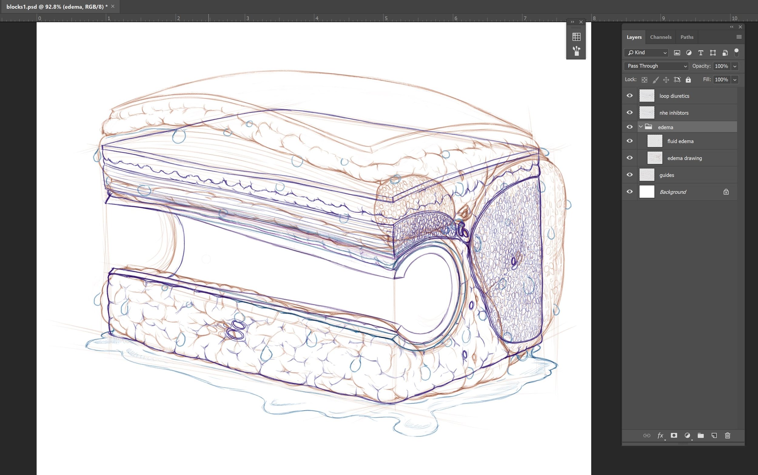
This is actually three digital sketches composited into something approximating what we think the end layout will be. These images, if approved will form the basis for the final illustrations. They're different colours so I can tell which layer I'm working on photoshop as they're all currently in the same document. It's important that there be a noticeable difference between them. Tough to do when you're showing the difference in effect between standard loop diuretics and newer NHE inhibitors.
Once these sketches are OK'd I can proceed to the fun part, at least for me: rendering. Fortunately, they're all OK so far. You might have noticed, however that at this point I haven't done anything about that cellular metabolism, mechanism of action image yet - the awful one. Well you're wrong. I have done something. I sat and thought about it. I've worked it all out on paper to the best of my ability and we've discussed it and agreed to simplify it a fair bit. But we'll cover it a bit later.
This is the working document for this image so far. As I mentioned above, the coloured pencil allows me to tell which layer I'm working on. This will get sorted out when I start to render the image in final. Also, the edema layer has an extra layer on top of that show water droplets. We thought it would be good show the tissue 'sweating' moisture to show how much fluid accumulates in it. If it doesn't work, it's not actually part of the drawing so it doesn't need to be incorporated. This also really just a cartoon as it doesn't represent any real anatomical part bu the concept of tissues and compartments holding fluid and swelling up with it.

